The Cyberix Network, although operating as a refuge for people interested in the true old Internet, fucking sucks in its website's design when compared to genuine examples from that era.
In contrast to actual old Internet websites, Cyberix consistently employs design techniques and decisions similar to modern websites and retro larpers, despite avoiding some of the more egregious pitfalls seen on places like Neocities.
Observe the following websites:
https://celephais.net/board/forum.php – unchanged since 2002, featuring a text-heavy layout with functional navigation via simple HTML links, no apparent large padding. Desktop-centric structure simplicity without any need for JavaScript.
https://megatokyo.com/strip/1 – unchanged since 2007, with multi-section organization (news, console, credits) using basic spacing, straightforward hyperlink navigation. Relies on direct URLs rather than "modern" interactive elements.
https://web.archive.org/web/20080703202514/http://www.php.net./ – 2008 PHP.net, structured around textual headings and lists for content like news and events. Embodies a simple, information-focused design typical of the time.
https://web.archive.org/web/20031001182919/http://www.txraves.org/main.php – a 2003 rave forum (replaced by chink porn, do not visit the modern site), displaying densely packed text, minimal padding, standard system fonts, and horizontal text-link navigation that's not friendly for phoneposters but Perfectly Functional without JS.
All these sites share sensible, computer-first design principles absent in Cyberix. They feature compact layouts without large bunches of padding, unique yet intuitive layouts easy to navigate, and a focus on dense, efficient design that loads SEAMLESSLY in old browsers.
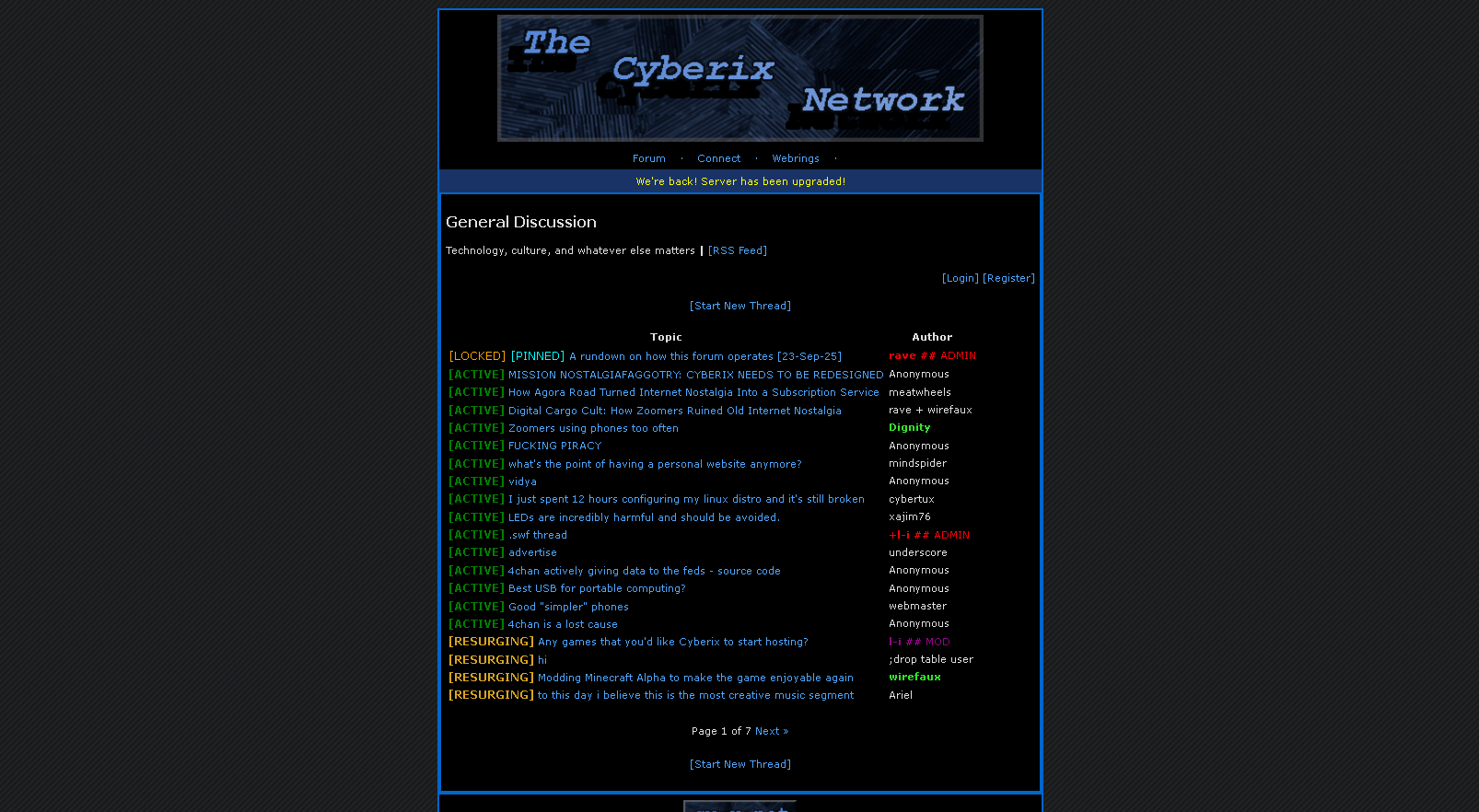
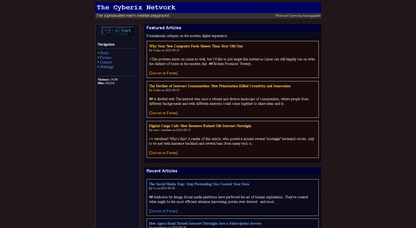
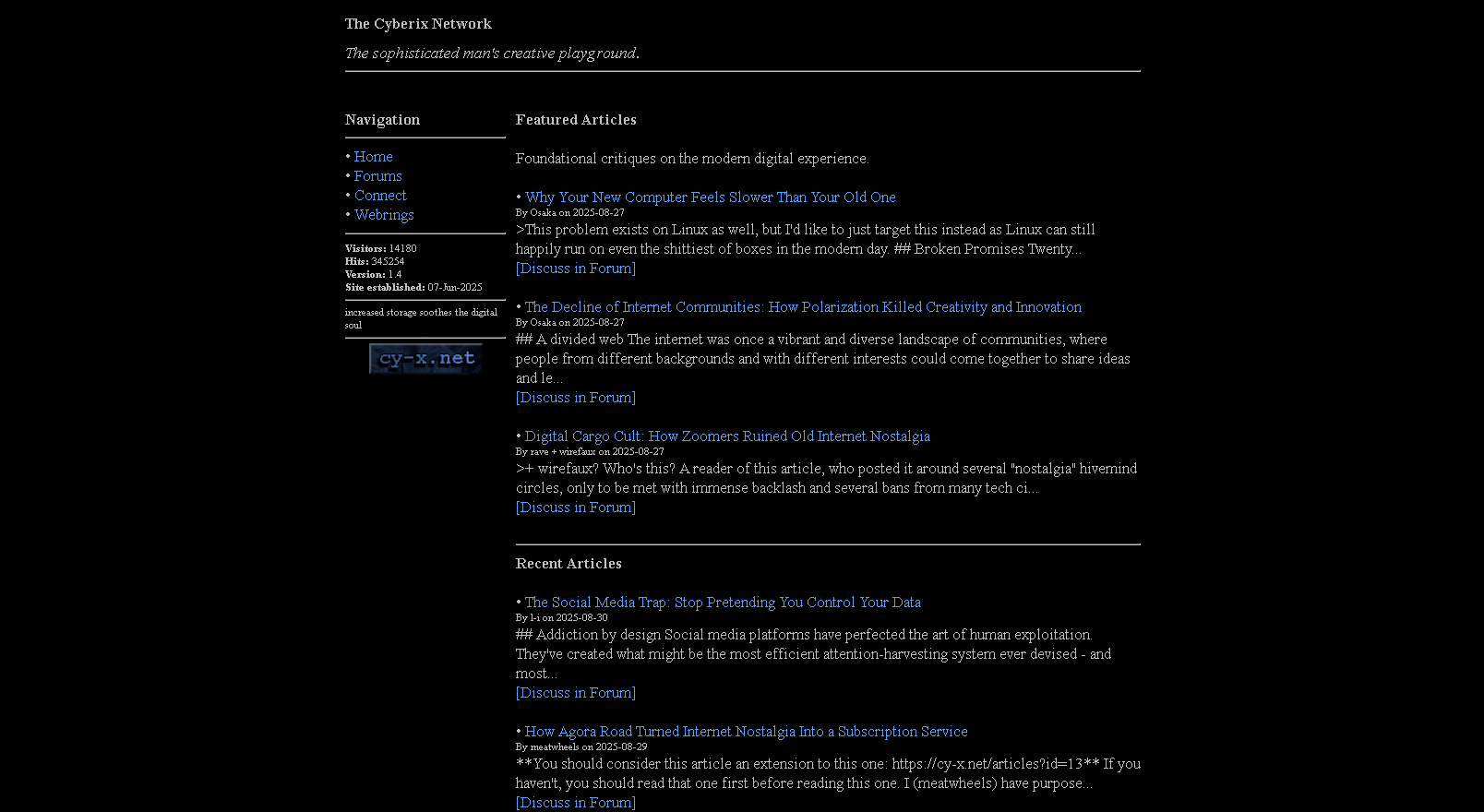
Cyberix's design, by comparison, is a padded, bloated, flat mess that would never have been built in the early Internet. https://cy-x.net/ uses categorized sections with markdown-like formatting that implies modern structural organization. There is a lot of unnecessary spacing and flat aesthetics not seen in the references. Forum topics, example being https://cy-x.net/forum?t=278 rely on contemporary styling leading to bloat, unlike the straightforward, JS-free navigation in the old examples.
Admin should take these references into heavy consideration for a total remake. Cyberix is missing KEY efficiencies like minimalistic spacing, pure text-based hierarchies, and browser-agnostic simplicity. Meanwhile it is failing horribly in areas that could be fixed by direct comparison. The astounding fact that it won't even load properly in an era-accurate browser, despite not requiring JS in modern ones, makes it painfully obvious how far it strays from authentic old Internet principles.