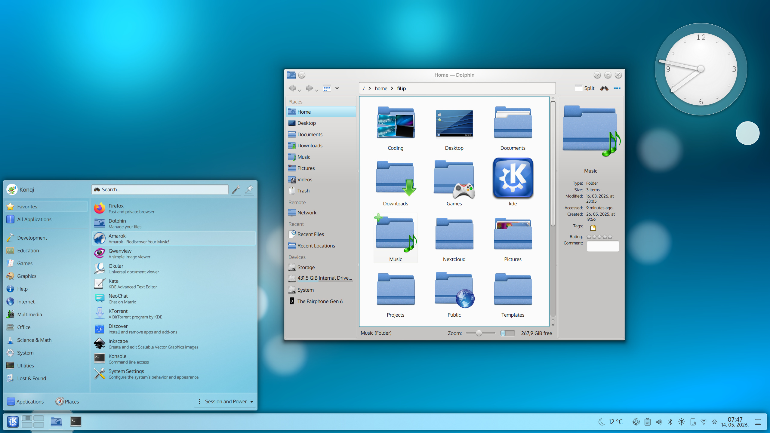
oxygen air 6.7 kde.jpg
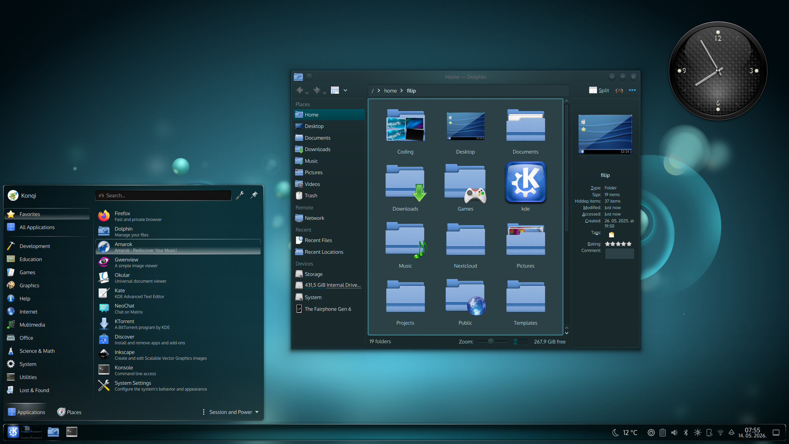
oxygen dark 6.7.jpg
We could all probably agree that Oxygen is not quite Oxygen without its iconic icons. Like with the Oxygen theme, there were also some issues with them. A missing icon here and there, a lack of high-resolution versions for some that were present. With a lot of work from Nuno Pinheiro, as well as from a new contributor by the name of Pravin Kumar, the icon set is much more complete now. The main feature is that with Plasma 6.7 it brings consistency in the look of tray icons:
We know some of you prefer having them colorful instead, so for the next release we'd like to make this an icon theme option.
Aside from these tray icons, I'm sure you will spot some hot new colorful ones too:
These new icons are available with the already released oxygen-icons 6.2. But that's not all… Oxygen icons are also back in the regular KDE Frameworks release cycle. They will now be released with updates every month!
Application style and window decorations improvements
Dolphin will look better with Oxygen
If you've used the default KDE file manager, Dolphin, with Oxygen, chances are you ran into a few visuals that didn't quite look right. The most prominent eyesore was probably the navigation bar when editable mode was turned on:
With KIO 6.27, there will no longer be this awkward second background; as a bonus, a highlight effect reappears:
The navigation bar version that's used when it's detached from the main toolbar has also been fixed, but for that change we have to wait for Dolphin 26.08 which comes out in August. In that same release we'll have a minor fix for filter button background too.
Another place that looked slightly off is the status bar, when in “small” mode. With Oxygen 6.7, this will be improved, although not made perfect. Screenshots in the merge request.
Ultimately, this small mode does not gel great conceptually with Oxygen due to Oxygen's glow around the content view. We'd therefore recommend Oxygen users to use to the full-width statusbar:
Dolphin -> App Menu -> Configure Dolphin -> Interface -> Status & Location bar -> Set Statusbar to "Full width"
Oxygen's very own korners bug fixed
A few months ago there was an amusing Reddit post with some very laudable detective work behind it regarding missing pixels in Oxygen's menus.
Well, we didn't end up deleting KDE… only those pixels:
Glow effect around windows no longer looks pixelated with fractional scaling
Thanks to Melissa Autumn, the Oxygen window decoration glow no longer looks pixelated with fractional scaling.
Missing titlebar buttons added
Some of you might have added an application menu to your window titlebars, only to notice the icon is exactly the same as the app icon. That wasn't a feature, but rather a bug; the hamburger menu code was there the whole time, just hiding. The same isn't true for the button that disables screen recording of windows, which is a new addition:
One final, honorable mention for style fixes: we now have one extra separator line less in config windows.
⚫️ Oxygen desktop theme
Oxygen's tasks design was reworked to support all panel orientations
Just like Oxygen's panel background, the design for the task was also missing support for all panel orientations except the “south” one. There was also the issue that the icons didn't always match the start menu icon's size or that the audio indicator escaped the panel. That's all been fixed with 6.7:
The Oxygen global theme becomes Oxygen Light and Oxygen Dark
In an unexpected turn of events, we've split the old Oxygen theme in half (so to speak)! While this wasn't initially planned, we figured some users might like to use the new feature that switches themes based on day-night cycles. Since the desktop theme doesn't get recolored though, it's not as full-featured of an implementation as Breeze's, however, at least the app color scheme can change.
There is now an Oxygen Dark color scheme and it's the new default
Speaking of color schemes… it always slightly bothered me that there was no “official” dark Oxygen one. Sure there were the likes of “Wonton Soup” and such, but Oxygen defaulted to a light color scheme. Keeping in mind that users may want to match the dark style between the desktop and apps, Nuno Pinheiro whipped up a new Oxygen Dark color scheme. Its feature is that it's tinted so it adapts really nicely to the wallpaper (if you use it for the accent color). This color scheme is now the default for the Oxygen Dark global theme, which is really the old, renamed Oxygen theme.
Oxygen's splash screen – also dark now
But why stop at the color scheme. What about the Oxygen splash screen? If we look at the background it was using, it's actually Air, not Oxygen! So in 6.7, I added a proper, dark Oxygen splash screen that blends with the desktop theme. The old, light one, is still there, just renamed to Air.
And why have an Air desktop theme and a splash screen and not an Air global theme?
Air's task design updated to include a minimized state
The Air inherited from old versions was missing some sort of indicator when windows are minimized. This becomes an issue with icons-only task manager, making it hard to discern which program is pinned, and which one is minimized. That's why a subtle underline was added to minimized windows. Admittedly, the line may be too subtle so we are certainly looking for your opinions for potential future improvements.
Some wallpapers of the past come to say hi again
Finally… as a way of saying thank you to users old and new… we added two classic KDE wallpapers – Air and Horos.
Both are the works of Nuno Pinhero and have been updated to modern standards. That means you'll find both a mobile phone and a widescreen version, as well as the normal version in 5K resolution. Enjoy 🍹
This is just the beginning
The Oxygen experience should be much improved from now on. We can't say it's in perfect state yet though, and that's where all of you come in. If you would like to help with reporting what you like or don't like about them you can file a bug report or come chat with us on the Telegram channel.
For 6.8 we want to keep fixing Oxygen, while having three other big goals in mind:
Adding accent color support throughout the desktop themes
Implementing the aforementioned monochrome/colorful option for the icon theme
And extending of Oxygen's theming to other toolkits
Some of you have asked if we are going to do a GTK theme and/or theme QtQuick/Kirigami apps. The answer is that we'd very much like to do that. It's just that it's not technically trivial and there's already been some bad experience with GTK on the Oxygen side. Instead of working on ports of Oxygen for these specific toolkits, ideally we help ourselves and other themes by collaborating on Union development so that we can ultimately have one style code that gets implemented to various toolkits.
Stay tuned because this old theme, turns out, still has a lot of life left in it. As for exploring new ones, Nuno might have something interesting in store for you soon…